June 2026: The Core Pipeline
This post covers the first month of development for the classbound package. June focused on building the core structure. Over the past four weeks, I wrote the base pipeline. The package now generates decision boundaries natively for any classification model. I laid the groundwork for everything else I will build this summer.
The Core Problem
Visualizing decision boundaries in R is difficult. Different classification packages use different commands for making predictions. They extract probabilities in different ways. A data scientist must write custom code for every model type to compare decision boundaries.
For example, rpart returns a matrix of probabilities. The randomForest package returns a different format. Some models do not return probabilities at all. This lack of a standard format causes many errors. I needed a single, standard way to process any model.
I solved this by building two main functions. These functions wrap the underlying packages. They create a clean interface for the user.
The Fit Function
The first goal was to create a single way to train models. I built the fit_model function to solve this problem.
This function takes the training data, a formula, and the native classifier function. The user does not need to learn specific prediction wrappers for each package. The user only needs to call fit_model.
# Load the palmerpenguins dataset
library(palmerpenguins)
penguins <- na.omit(penguins[, -c(2, 7, 8)])

# Fit an rpart decision tree
tree_model <- fit_model(
  data = penguins,
  formula = species ~ bill_length_mm + bill_depth_mm,
  classifier = rpart::rpart
)

# Fit a random forest on the same data
rf_model <- fit_model(
  data = penguins,
  formula = species ~ bill_length_mm + bill_depth_mm,
  classifier = randomForest::randomForest
)
This simple interface hides the complex code inside. The function evaluates the formula, extracts the training features, and trains the specified native model. It returns a standard object.
The Predict Function
I also needed a standard way to make predictions. I built the predict.classbound method.
This S3 generic takes the trained model and a new dataset. It formats the predictions into a standard list. This list always contains two things. It contains the predicted class labels. It also contains the prediction probabilities.
# Create some new data points
new_data <- data.frame(
  bill_length_mm = c(45.1, 52.2),
  bill_depth_mm = c(15.5, 18.9)
)

# Get standard predictions
preds <- predict(tree_model, new_data)

# The output format is always exactly the same
# preds$class -> The predicted label
# preds$probs -> The probability matrix
This standard format is very important. It allows the rest of the package to expect the exact same data structure. I never have to write special code for specific models inside the plotting functions.
The Model Object
I created an S3 class named classbound. S3 is an object-oriented system in R. I use this class to store metadata. It moves data between the different steps of the pipeline.
When a user runs fit_model(), the function returns this object. The object contains the unmodified, native fitted model. It also contains the training features and the factor levels.
# A look inside a classbound object
list(
  # The actual unmodified native model returned by the algorithm
  fit = native_model_object,

  # The features used to train the model
  features = list(names = c("bill_length_mm", "bill_depth_mm")),

  # The original class levels in the training data
  class_levels = c("Adelie", "Chinstrap", "Gentoo")
)
This structure keeps the data clean. I tested the full process using the penguins dataset. I checked the structure of the returned object to ensure it matched my design.
S3 Dispatch and Internal Adapters
At first, fit_model() used a large switch() statement to pick the model. This switch statement checked a method string. It then ran the matching code block. This meant I had to edit the core package file to add a new model.
I recently refactored the entire architecture to use standard R behavior. The fit_model function now accepts a native function directly (e.g., rpart::rpart). It executes it and stores the raw result.
When you call predict() on the classbound object, the system uses internal S3 dispatch via a function named predict_adapter(). This function dispatches natively on the underlying model’s true class.
I added support for more models this month using this system:
PPtreeExtrandomForestPPforestPPtreeViz
Each of these models has its own adapter file. The code is highly modular.
Support for Custom Models
The S3 dispatch change brings another huge benefit. It allows users to natively support custom models.
A user can write their own adapter for a new model type. A user only needs to write one S3 method in their own environment. They do not need to change my package code at all.
For example, a user wants to add support for a model class named mymodel. The user just writes the predict function:
# Define how to predict with the custom model
predict_adapter.mymodel <- function(model, newdata, ...) {

  # Get predictions from the custom package
  raw_preds <- mymodel::predict(model, newdata)

  # Format into the standard list
  list(
    class = raw_preds$labels,
    probs = raw_preds$probabilities
  )
}
The pipeline finds the custom adapter automatically. The package generates boundaries for the custom model.
Data Validation
I must use consistent factor levels when I compare two different models. One model might train on a subset of data. That subset might lack a specific class. If I plot the boundary, the colors will not match the other models.
To prevent this, fit_model() saves the original class levels. It stores them in the classbound object. The predict.classbound() function applies these original levels to the predictions. This keeps the colors matching across all plots.
Computing Boundaries
I built the boundary generator next. The goal was to separate the boundary math from the model algorithms. I created the boundary_compute() function to do this.
This function builds a grid of prediction points. It reads the range of the features from the training data. It finds the minimum and maximum values for each feature. It generates a dense grid of points across that range.
# Compute the boundary grid with 100 points per axis
grid <- boundary_compute(tree_model, resolution = 100)

# The grid contains 10,000 rows (100 * 100)
# It contains the coordinates and the predicted class
head(grid)
It sends this grid to predict(). The model predicts the class for every point in the grid. The function returns a data frame. This data frame holds the coordinates, the predicted classes, and the probabilities.
The Plotting Engine
I then built plot_boundary() using ggplot2. This function consumes the data frame. It draws the decision areas on a plot.
The function maps colors to the different classes. It fills the background of the plot based on the grid predictions. It creates a smooth visual map of the model logic. It can also add the original training data points to the plot as dots.
To see this in action, here is a complete example. We fit a Random Forest classifier on the Palmer Penguins dataset, compute the boundary across a dense grid, and visualize the non-linear decision regions:
library(classbound)
library(palmerpenguins)
library(randomForest)

# Prepare a subset of the penguins dataset
data <- na.omit(penguins[, c("bill_length_mm", "flipper_length_mm", "species")])

# Fit the Random Forest model natively
model <- fit_model(data, species ~ ., randomForest)

# Compute the boundary grid over the feature space
model <- boundary_compute(model, resolution = 300)

# Generate the visualization natively using the S3 generic
plot(model) +
  ggplot2::labs(
    title = "Non-Linear Decision Boundaries with classbound",
    subtitle = "Random Forest classifier on Palmer Penguins dataset"
  )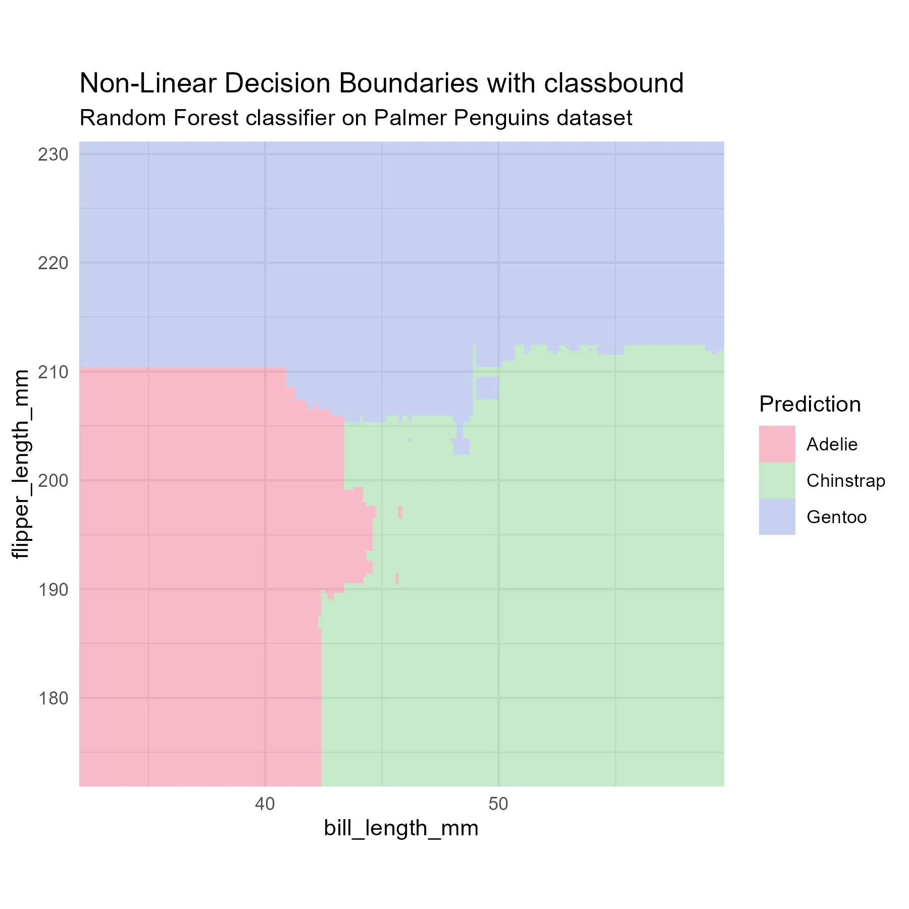
As you can see, the final result is a beautiful ggplot2 graphic. The model identifies three clear regions: Adelie penguins (red) occupy the space with shorter flippers and shorter bills, Chinstrap penguins (green) have shorter flippers but longer bills, and Gentoo penguins (blue) are distinctly separated by their much longer flippers. Because we used a Random Forest, you can clearly see the highly complex, jagged, non-linear boundaries where the trees disagree along the borders!
If you look closely at the Random Forest plot, you will also notice that the colors are not solid; they fade into white gradients near the boundary lines. This is not a rendering glitch or jitter! When a model is capable of outputting prediction probabilities (like a Random Forest), classbound automatically extracts them and maps them to the visual transparency (alpha) of the plot. Deep, saturated colors indicate areas of high model confidence. Pale, faded regions indicate areas where the model is highly uncertain. This continuous gradient allows you to visually map the model’s confidence across the entire feature space.
To show how easy it is to compare different algorithms, we can swap randomForest for a standard rpart decision tree in our fit_model() call:
library(rpart)

# Swap to a simple decision tree
model_tree <- fit_model(data, species ~ ., rpart)
model_tree <- boundary_compute(model_tree, resolution = 300)

plot(model_tree) +
  ggplot2::labs(
    title = "Orthogonal Decision Boundaries with classbound",
    subtitle = "Single Decision Tree (rpart) on Palmer Penguins dataset"
  )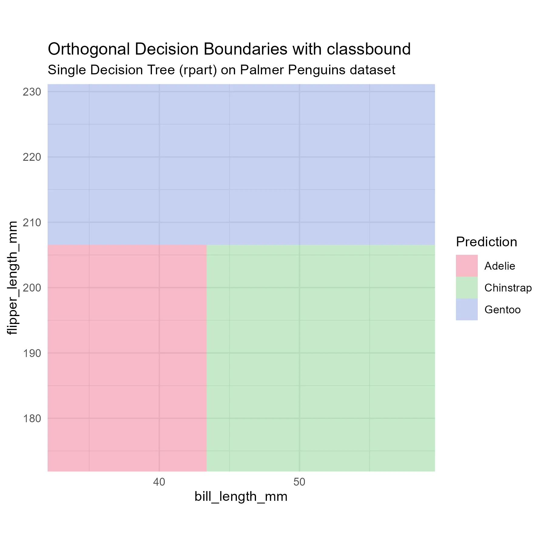
Instantly, the visual difference is striking. Unlike the jagged non-linear borders of the Random Forest, the single rpart decision tree creates strict, orthogonal (rectangular) splits across the feature space. Being able to visually compare these model behaviors side-by-side without rewriting plotting logic for each package is exactly why I am building classbound!
Not all models return probabilities. I designed the code to handle missing probabilities. The plot generation still works for these models. It draws solid boundaries without color gradients. It uses the hard class labels instead of the probability values.
Memory Limits
My current grid generation has limits. I use dense combinations right now. This approach generates a point for every combination of features.
This works well for two features. A grid of 100 points per feature creates 10,000 rows. A grid of 100 points for three features creates 1,000,000 rows. Four features create 100,000,000 rows.
This causes the computer to run out of memory. This approach uses too much memory for data with many columns. I cannot generate dense grids for high dimensions. I need a better way to handle complex models.
Next Steps
I will focus on high dimensions in July. I will project the data into two dimensions to compute the boundaries.
I will use projection tools to reduce the features. I will only generate a grid for the two projected dimensions. This avoids generating large multi-dimensional grids. I can then plot the boundaries for models with any number of features. This will be the main challenge for the second month of the project.